

Authentication with our UI components
Account Kit allows you to use pre-built, highly customizable UI components to handle authenticating your users. These components provide flexibility to:
- Use the pre-built modal or embed the auth card directly in your app
- Choose from multiple authentication methods
- Customize authentication method UI
- Customize theme
Available Authentication Methods
Account Kit supports several authentication methods that you can implement with pre-built UI components:
- Email OTP - One-time password sent via email
- Email Magic Link - Authentication links sent via email
- Social Login - Authentication with providers like Google and Facebook
- Custom Social Providers - Add custom OAuth providers via Auth0
- Passkey Signup - Create accounts with passkeys
- Passkey Login - Authenticate with existing passkeys
- Multi-Factor Authentication - Add an additional verification layer after initial login using an authenticator app
Each authentication method page includes specific configuration options and examples for both pre-built UI components and custom UI implementations.
Multi-Factor Authentication (MFA)
If your users have an authenticator app (TOTP) set up, the UI components will automatically prompt them for their 6-digit code after they complete any primary login method (e.g., Email OTP, Email Magic Link, or Social Login). No extra configuration is required in the UI component – just enable MFA for your users.
Modal auth
Assuming your application has been set up, using UI components is the easiest way to authenticate users. All you have to do is leverage the useAuthModal hook and provide users a CTA to open the modal.
import React from "react";
import { useAuthModal } from "@account-kit/react";
export default function MyPage() {
const { openAuthModal } = useAuthModal();
return <button onClick={openAuthModal}>Authenticate</button>;
}That's it! When the user clicks that button, the modal will open and they can complete authentication. Once they are authenticated, you can use the useAccount hook to get the logged in user's SCA address.
Want to display a loading state during authentication?
For authentication with redirects in a modal, you may want to add a loading state when users are waiting for authentication to complete.
To do this, manage the loading state directly using our hooks, as shown below. In embedded authentication and non-redirect flows, such as passkey authentication, we handle the loading state for you.
import { useAuthModal, useSignerStatus } from "@account-kit/react";
import { useEffect } from "react";
const { openAuthModal } = useAuthModal();
const { isAuthenticating } = useSignerStatus();
useEffect(() => {
if (isAuthenticating) {
openAuthModal();
}
}, [openAuthModal, isAuthenticating]);Embedded auth
The body of the Auth Modal is also exported for you to use directly in your application. This is useful if you don't want a modal flow for login and want a standalone page using the card.
import React from "react";
import { AuthCard } from "@account-kit/react";
export default function MyLoginPage() {
return (
<div className="flex flex-row p-4 bg-white border border-gray-200 rounded-lg">
<AuthCard />
</div>
);
}That's it! The user can now input their credentials and complete login. Once they are authenticated, you can use the useAccount hook to get the logged in user's SCA address.
Customize authentication UI
When rendering the authentication component to your users, it's possible to customize the various sections a user will see as well as the content of the modal.
How does the UI config work?authproperty accepts asectionsobjectsectionsobject is an array of arrays representing the various sections in descending order, each section (element in the outer array) separated by a divider in the UI- each item within a section is an
AuthTypesobjects containing configuration parameters for that authentication method.
AuthTypes
can be passed into sections:
This adds an email login to a section. For detailed information on email authentication, see Email OTP and Email Magic Link pages.
Passkey
This adds a passkey login method to a section. For detailed information on passkey authentication, see Passkey Login and Passkey Signup pages.
External wallets
This adds an external wallet login method to a section. This allows users to connect to your app with existing EOAs via browser extension or WalletConnect.
type ExternalWalletsAuthType = {
type: "external_wallets";
// if this is undefined, wallet connect will not be displayed
walletConnect?: WalletConnectParameters;
};Social
This adds social authentication methods to a section. For detailed information on social authentication, see Social Login and Custom Social Providers pages.
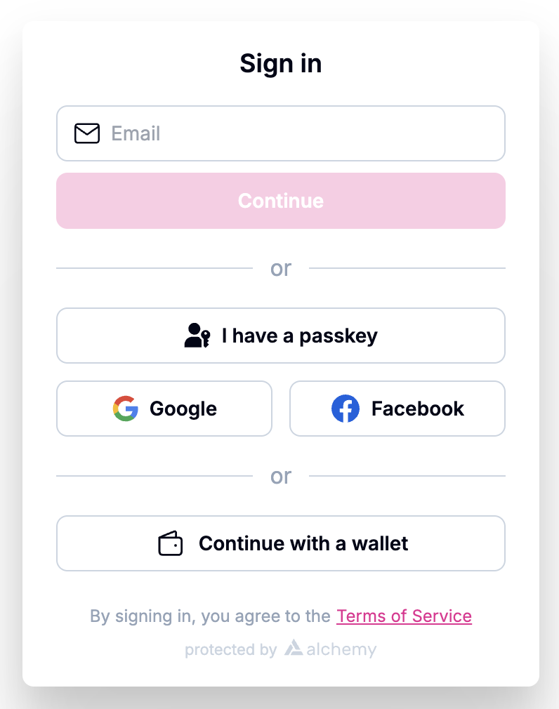
Example
Here's an example UI configuration which adds 3 sections to the auth modal. The first section contains an email auth, the second section is for passkey login and 2 social auth logins (google and facebook), and the third section is external wallets.
import { AlchemyAccountsUIConfig, createConfig } from "@account-kit/react";
import { sepolia, alchemy } from "@account-kit/infra";
const uiConfig: AlchemyAccountsUIConfig = {
illustrationStyle: "outline",
auth: {
sections: [
[{ type: "email" }],
[
{ type: "passkey" },
{ type: "social", authProviderId: "google", mode: "popup" },
{ type: "social", authProviderId: "facebook", mode: "popup" },
],
[
{
type: "external_wallets",
walletConnect: { projectId: "your-project-id" },
},
],
],
addPasskeyOnSignup: false,
},
};
export const config = createConfig(
{
transport: alchemy({ apiKey: "your-api-key" }),
chain: sepolia,
},
uiConfig
);This example would output a modal similar to this image:
Need More Control?
If you need complete control over the user experience, you can implement your own custom UI using Account Kit hooks. See the Authentication with React Hooks page and the individual authentication method pages for detailed implementations.